Volt ink.
Category: book publishing, design, relationship management
Role: art director, visual designer, photo editor, style director, production artist
Project Summary: For more than seven years, I worked as the Senior Art Director for Weldon Owen, a custom publishing company that creates and publishes books specializing in celebrity chef and culinary books for independent and renowned national brands. Here I'm highlighting the creative process I used for a cookbook in collaboration with brothers and Top Chef contestants Michael and Bryan Voltaggio (Michael won the competition), titled Volt ink. I created a complex, intelligent yet personable journey that shared unique recipes, brotherly love, and a little friendly competition. The launch of this book was accompanied with a custom clamshell package and candid portraits, bonus video recipes, recipe demos by the Voltaggios nationwide at Williams-Sonoma stores, and numerous book-signing events and media appearances
Branding Partnership
Creating a book for a chef can be an incredibly personal journey, as the book is often a reflection of their career, brand, personality, and perspective on the culinary craft. I partnered with Michael and Bryan, as well as Williams-Sonoma (our co-publisher), to create a book that captured the chefs’ take on the world of food in their very first book.
Photo Strategy
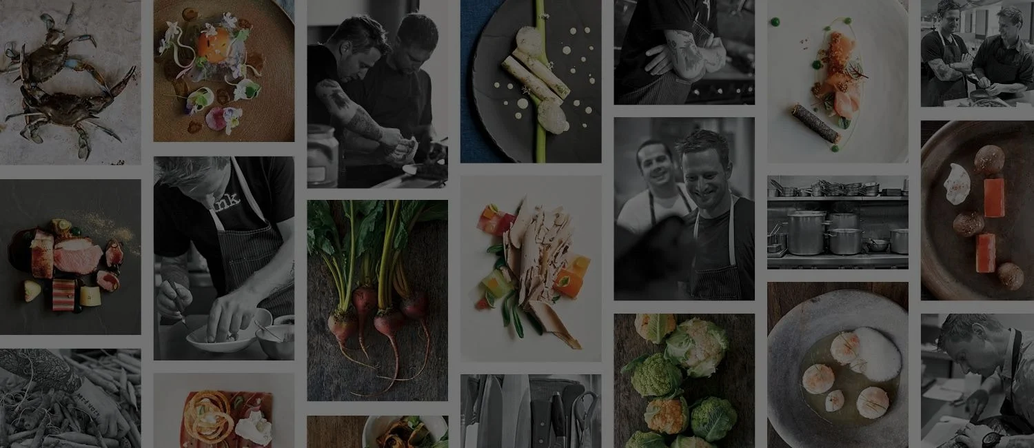
In addition to recipes, there are intimate stories of how food made an impression in the chefs’ childhood, their families and personal beliefs. I envisioned a very specific photo style that clearly shifted between food photography and candid images of food prep and personal interactions. The full color, overhead shots of the food boldly stamped the brothers’ mark on the food, while the black and white candids captured the controlled chaos of the chefs’ kitchen and the passion the two bring to their art. All the food images and candids were shot in their working restaurants, along with some in-studio photoshoots.
Page Layouts
I wanted the page design to feel strong, confident and masculine. The font selection of DIN provided sharp angles and multiple styles that created texture and structure. This style variation allowed the quotes from the brothers that accompanied each recipe to stand out. I further relied on typography by using the dense copy blocks to my advantage and making them into graphic elements on the page. The result is a unique and compelling book. Throughout every single page, the voices or faces of Michael and Bryan came through
Cover Evolution
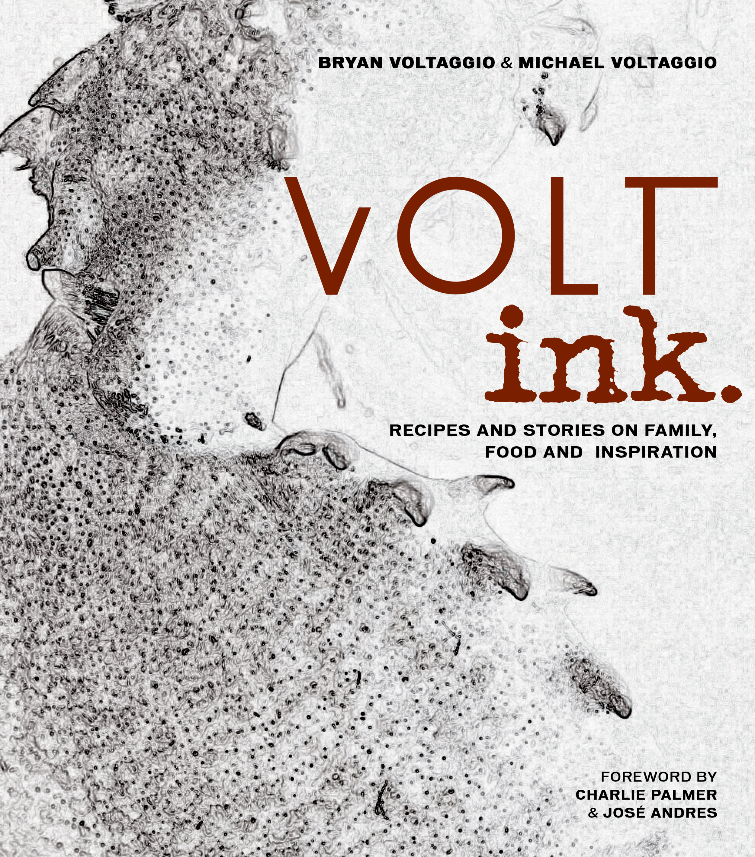
The unique structure of this book and the Voltaggio's willingness to break free from what is traditionally expected in a cookbook, allowed me to experiment with cover directions. Whether it was with the words of the food families explored in the book, the surface of the dark bar counter top from Michael's restaurant, or with a visual study of a crab's claw, the cover options reflected the layers, texture and boldness also found in the brothers' food.
Final Product
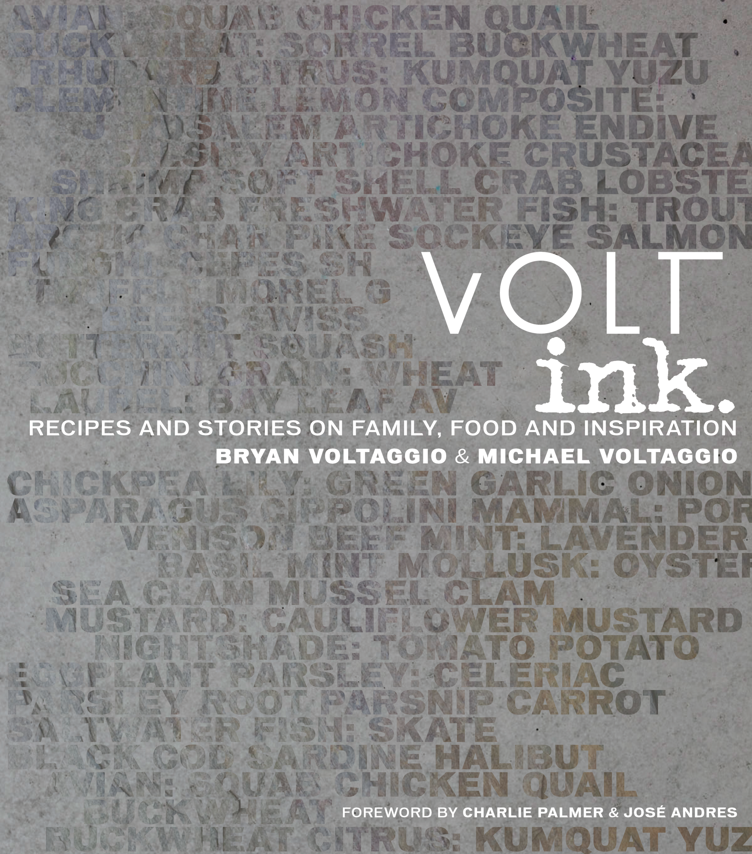
The final cover centered on the book's core message of family by combining a visual pattern with the names of the food families (which was emphasized by a spot gloss UV coat on the words and copper foil on the book title for additional texture) and the background image is the surface of the bar in Michael's restaurant that was custom made. The variation in the bar surface was added by Michael and represents the hard work and commitment the brothers poured into their physical space and relationships. The logos of each of their restaurants make up the name of the title itself and branded their professional journey. The oversized book fitted snuggly into a cloth clamshell box with a picture of the brothers working side by side.
more book design
Elite Wedding Collection Magazine
Category: magazine publishing, wedding and travel design, project management
Role: art director, designer, photo editor, style editor
Project Summary: For 11 years, I worked as Art Director and Lead Designer for the international magazine Elite Wedding Collection: Destination Weddings, Honeymoons and Trips for Two. The one-of-a-kind publication, which had a circulation of 25,000, catered to brides looking for the ultimate resort destination to tie the knot and enjoy a romantic getaway. It also featured the latest travel and bridal products, services and advice. In my position as Art Director, I established long-lasting relationships with numerous travel and wedding photographers from around the world. I also sought out fashion designers and helped source services and products that highlighted the theme of each issue. Being part of a small staff meant that I worked side by side with the Editor-in-Chief and Publisher to structure each issue, including editorial and art content
Strategic Partnerships
One of my favorite tasks was searching out and working with top of the line photographers from around the world. By cultivating thoughtful relationships with them, I was able to feature award winning photography issue after issue while meeting our shoestring budget. Our pages were also filled with images of curated products and custom services, most of which I researched and tracked down. This combination of stunning photography, must-have products, and one of a kind services gave a voice and personality to the publication
Page Design
My approach for page design was to lead with visuals. The front-of-book pages are always tricky, requiring you to pack lots of elements into a limited space. I strived to find the right balance of images and text to tell the story the editor wanted to highlight. In one example above, to showcase the “color of the year,” I sought out beautiful wedding trends and items that featured that specific color. Then I fused these elements together to tell a cohesive, visually appealing story. When approaching a feature piece, I used strong typography to complement the compelling photography. I am a sucker for the way type can serve double duty: verbally communicating with the consumer while aesthetically setting the mood
Covers That Sell
As with any magazine cover, there is always a fine line to walk and our goal was twofold: to sell the destination and sell the story of love. Sometimes we focused on love. Sometimes we made it all about the destination. And often, it was a combination of both. Whatever the scenario, the image and crisp copy had to strike an emotional chord and stop a consumer in her tracks. Elite Wedding Collection was published for 11 years (from 2003 to 2014) and distributed in a dozen countries as well as bridal shows across North America.
Want to see more?
Email me at akar123@gmail.com for more details.
